Instapay
MOBILE DINING PAYMENT APP
Project Description
Instapay is a mobile payment app that allows dine-in customers to easily pay for their meal through their phones. Customers can pay whenever and however they want so that they can enjoy their dining experience without interruptions. Customers can also split the bill with others, making it easy for all types of payment. Receipts are digitally recorded and saved for easy review and export (for business/personal purposes).
As the team's UX and visual designer, I was in charge of mapping out the app flow, planning features, designing high fidelity mockups, creating illustrations and prototyping. I was also in charge of visuals and illustration for the promotional website. My other roles in the team involved ideation, research, and user testing.
Promotional Website
Prototype
Team: Jessica Chu, Josh Cheng, Rosanne Wong
Tools: Adobe Illustrator, Photoshop, AfterEffects, Marvel, HTML/CSS
Type: Academic Case Study
Project Length: 5 Weeks (Fall 2015)
DESIGN PROCESS
Opportunity
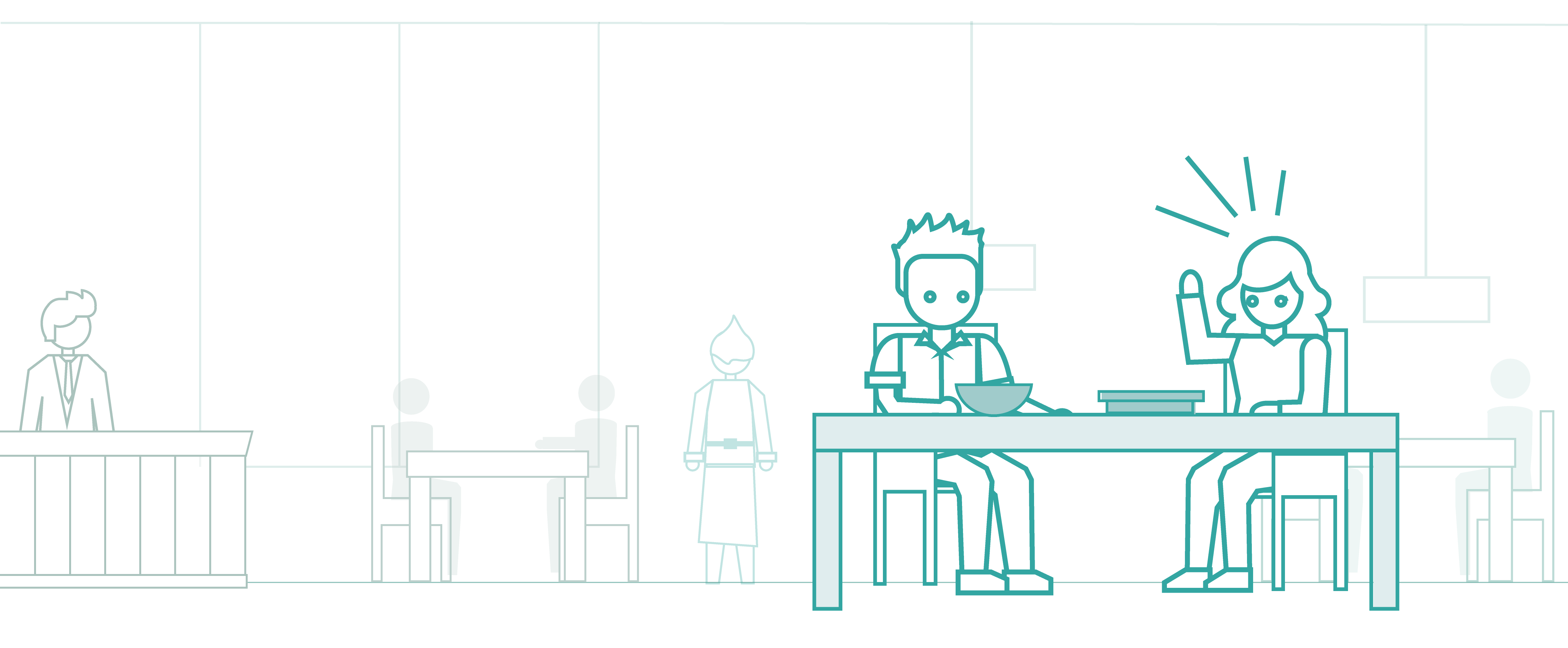
Tables are being filled up, orders are being taken, waiters are putting down food - it's chaotic in the restaurant. Trying to flag down a waiter to pay the bill can be quite a hassle. Once you’ve got their attention, you have to wait for them to bring you the machine! Everyone has experienced this at least once during their time in a restaurant, especially happy hours or dinner time.
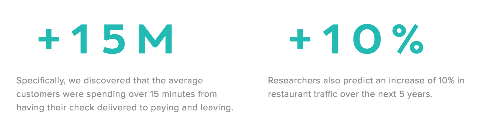
From personal experience, I pitched this idea and proposed a concept payment app that would make the dining experience more seamless and fast. I conducted initial research to determine the validity of this problem. Research showed that people are spending more time at restaurants for a variety of reasons, including waiting for the bill. Excess time spent in the restaurant affects the dining patrons and people waiting in line for a table (customer experience), thereby slowing down the restaurant's ability to turn tables (business problem).
Understanding the Users
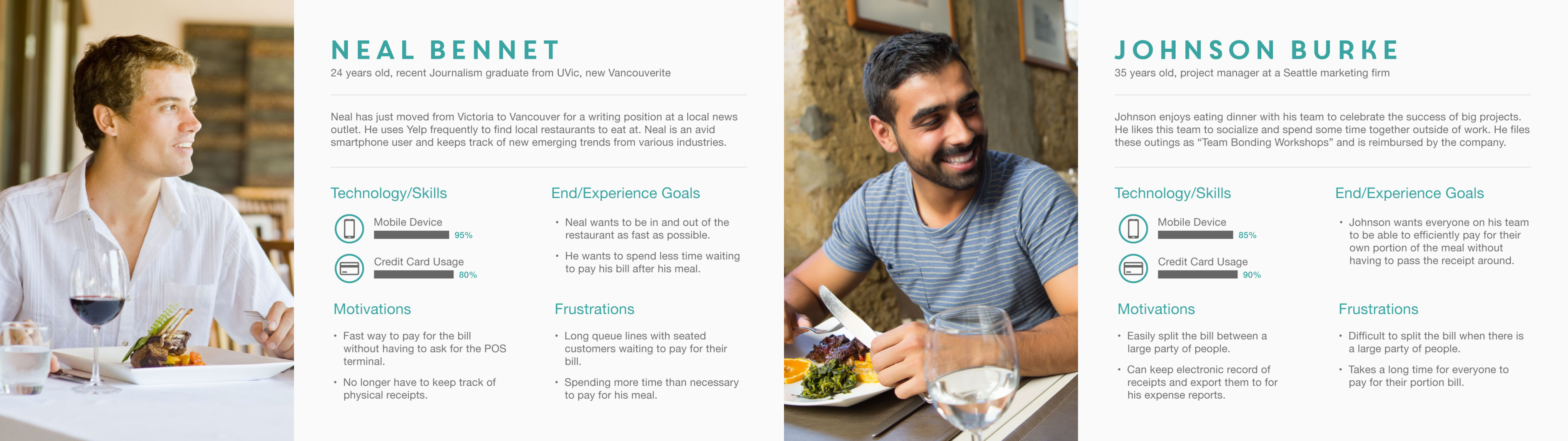
Once we clearly identified the design problem, I helped create two personas representing our core target audience (young, affluent working millenials) to identify their key needs, goals, and expectations. We wanted to focus on three major aspects: fast process, easy payment, and automatic receipt tracking.
Customer Journey Framework
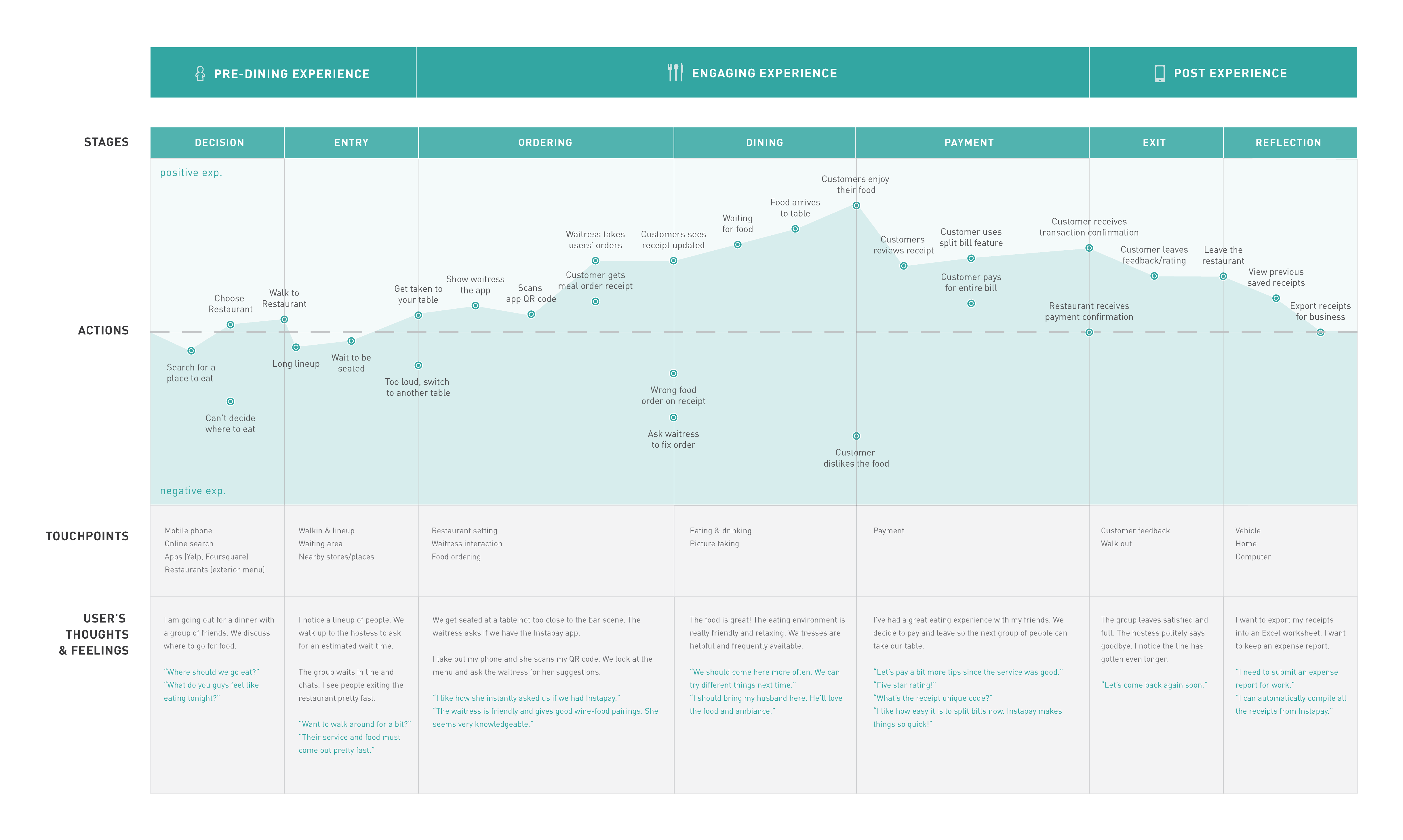
From our user research, I mapped out a user journey diagram to visualize the various touchpoints of a customer’s restaurant experience and how our digital experience would be integrated. I identified the various painpoints and emotional journey of a typical user. This revealed potential opportunities where we could improve the user’s experience and overall quality of the dining experience.
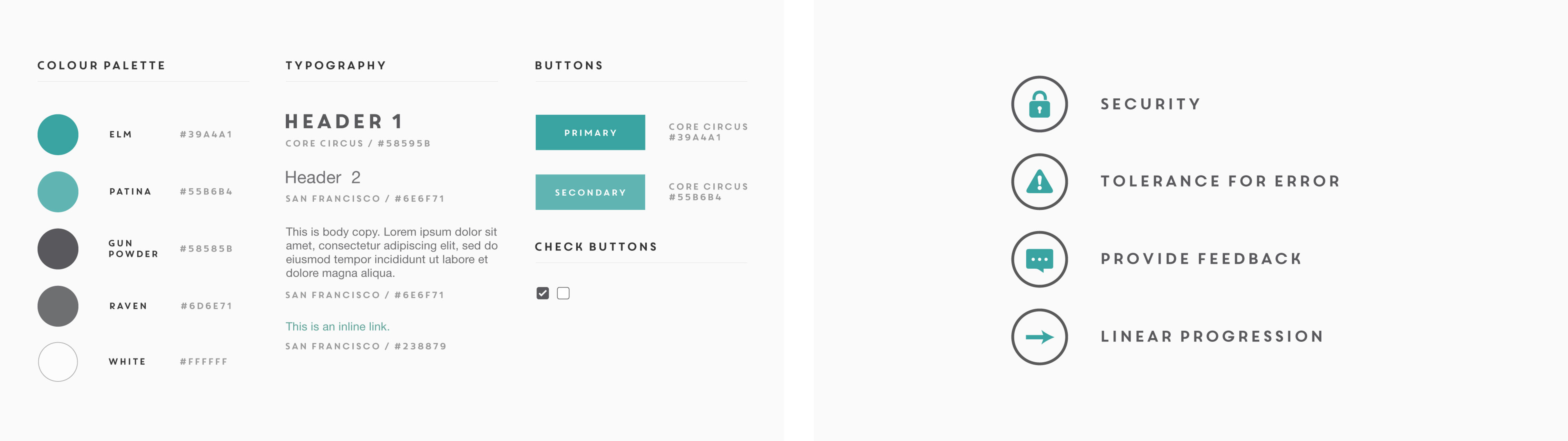
Brand Guidelines and Principles
To guide our project, we created a set of product principles: security, tolerance for error, feedback, and a linear progression. These principles served as guidelines for our app experience and design to abide by.
Security: Ensure that all payment information is secure and protected
Tolerance for Error: Allow users to easily change their payment methods/information
Feedback: Provide intuitive feedback to indicate progress to users
Linear Progression: Make the payment process quick and seamless (reduce user steps)
We also created a style guide to represent the product brand - choosing the core color scheme, typography, visuals, and components used in the app. This document helped the team to create and iterate on designs within a single cohesive visual style.
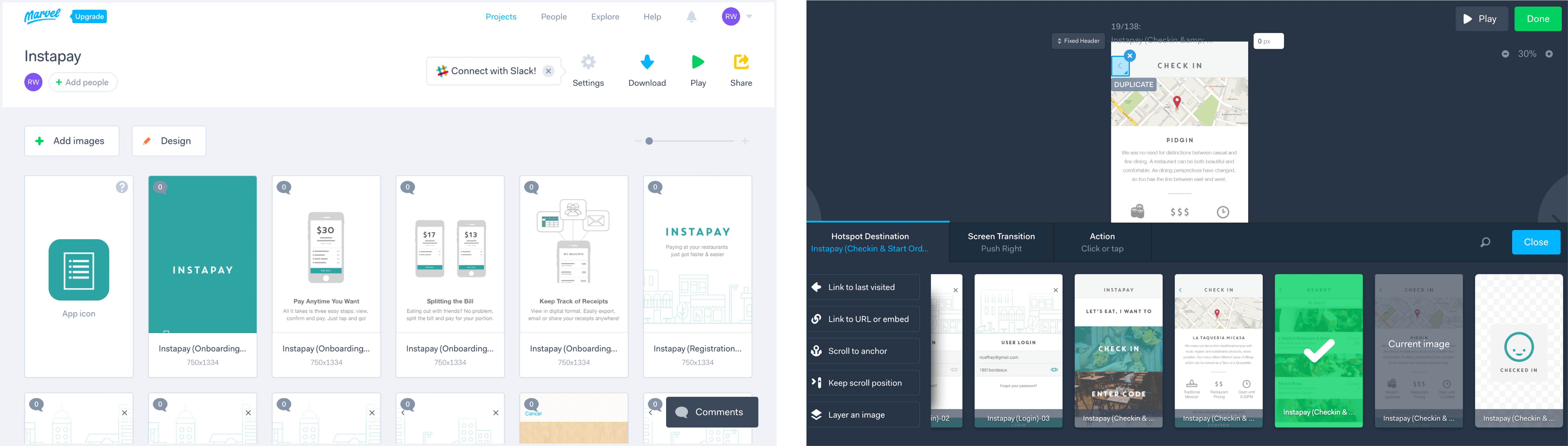
User Testing & Prototyping
I converted the first iterations of wireframes into high fidelity mockups to test with potential users. I helped put together the prototype using Marvel, working on the interactions and navigation of the app. I screened, interviewed and selected candidates for our initial user testing. We utilized two IDEO methods, Thinking Aloud and User Interviews, for user testing. I also talked to people who worked in the restaurant industry (waiters/waitresses, bartenders, managers) about the dining scene and where we could intervene to improve on the dining experience. This provided a lot of useful insight and we incorporated their feedback in the final form and feature set.
Testing Documentation and
Revisions
APP INTERFACE
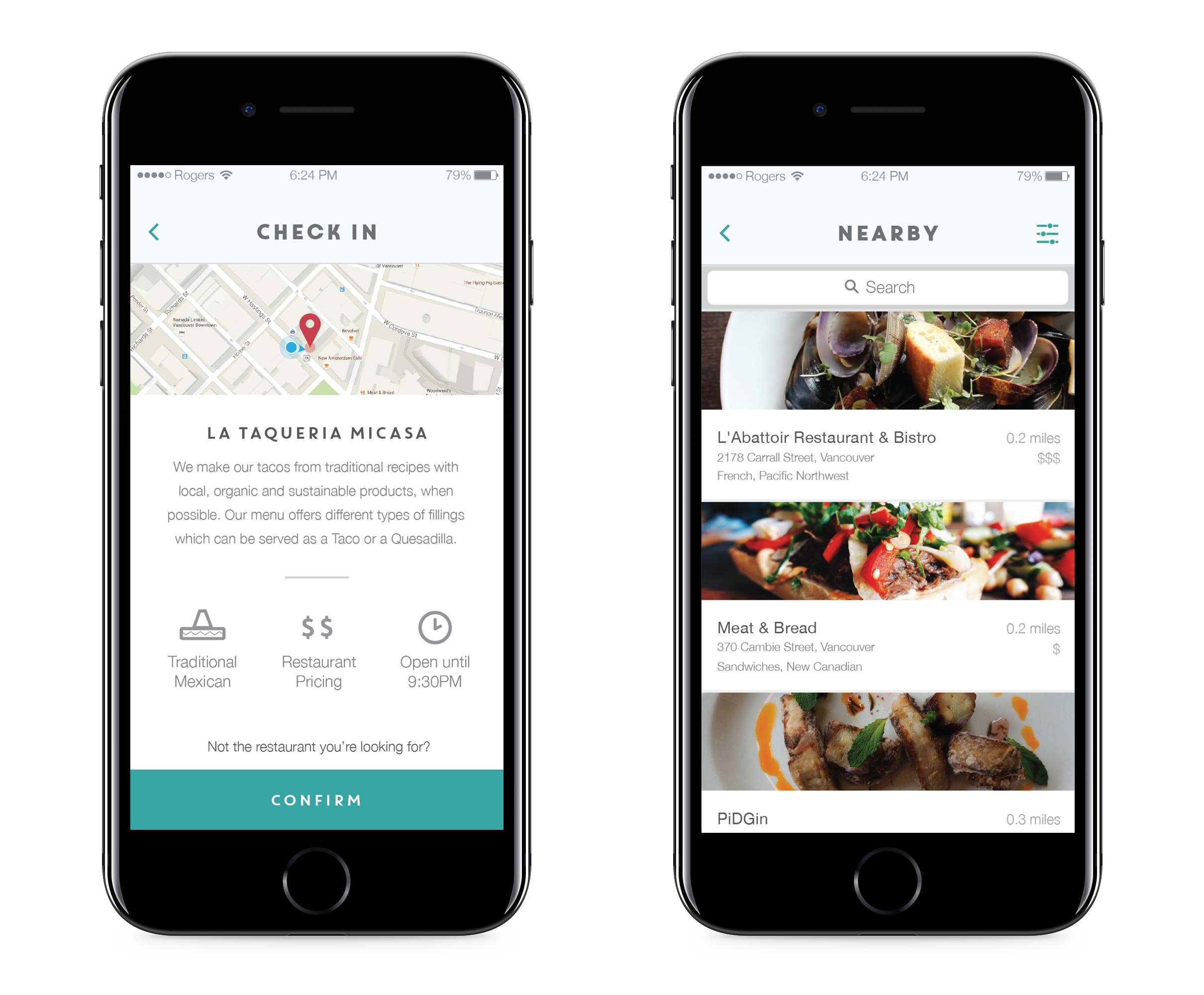
Checking into Restaurant
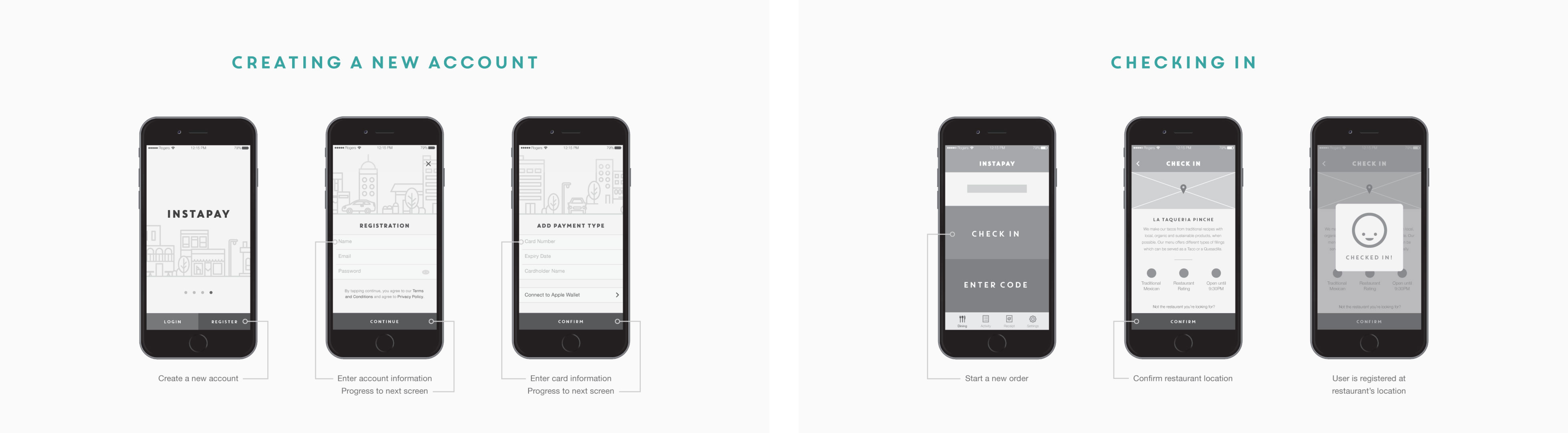
When the user opens the app, they can immediately check into the restaurant. The app will use the phone's GPS location to determine which restaurant the user is at and the user can confirm to sign into the restaurant. If the restaurant is incorrect, the user can select the correct one from a list of nearby restaurants.
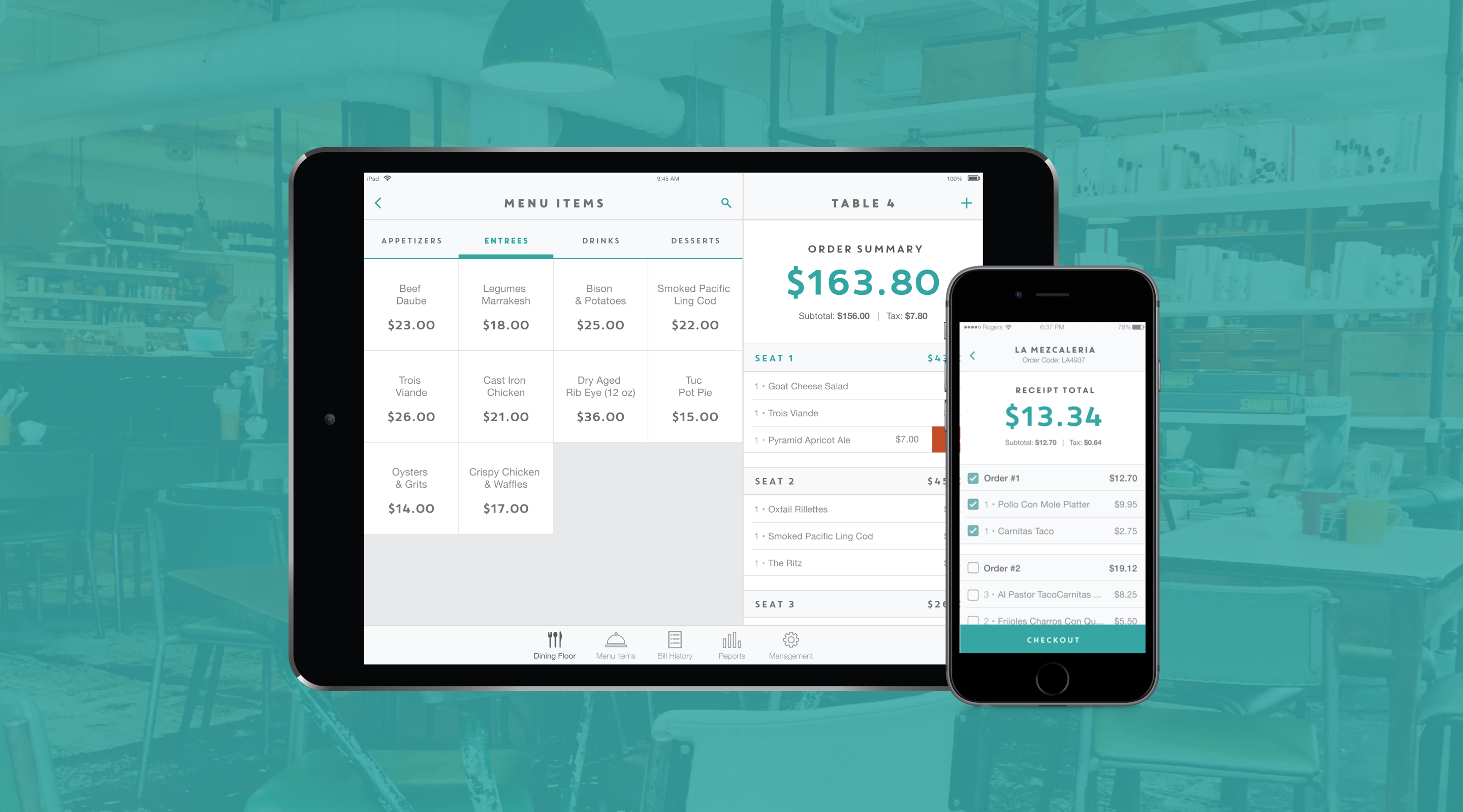
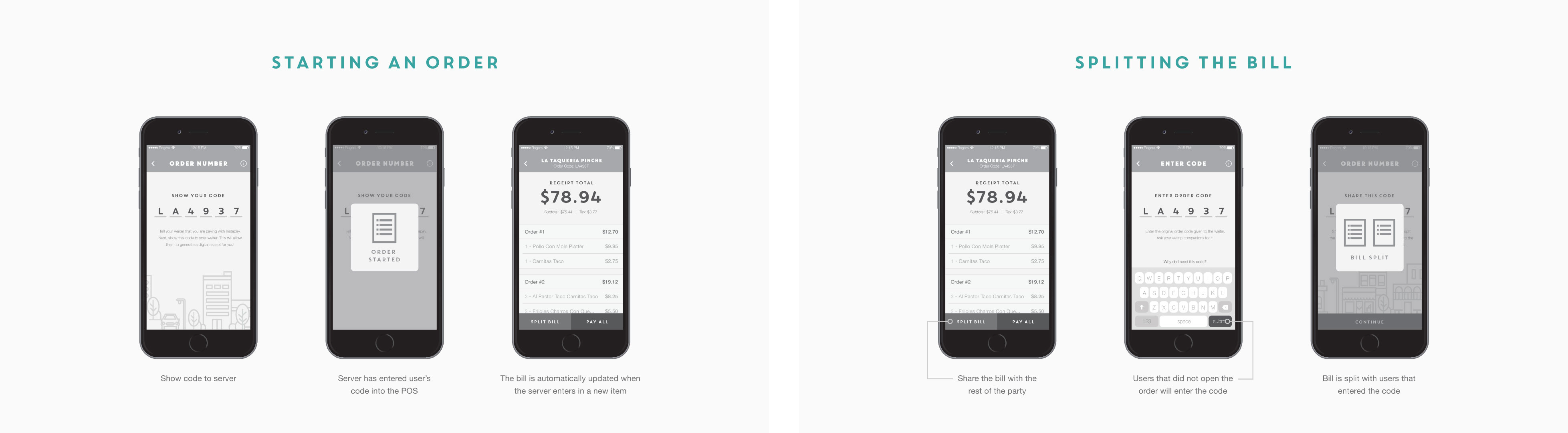
Once the user has checked in, they'll be presented with a unique 6 digit code to share with the waiter. The waiter can then input the code onto the restaurant's Instapay POS app to generate a digital receipt. Now the user can see their bill updated in real time when the waiter enters in orders.
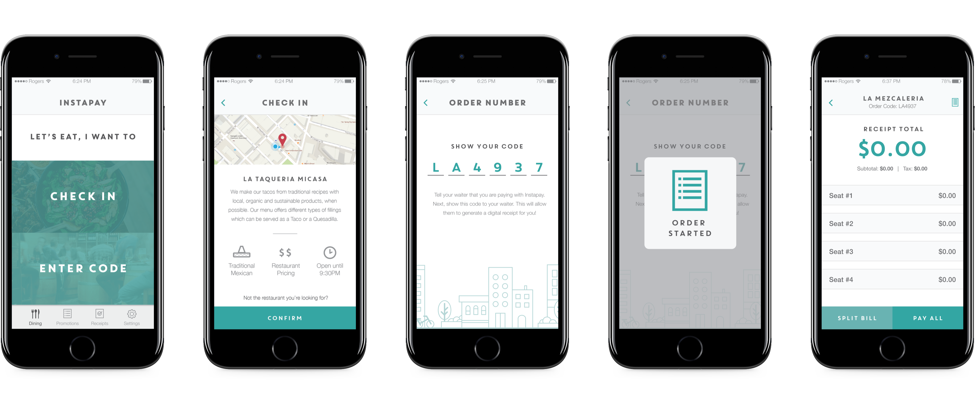
Changing Restaurants
If the app does not correctly select the right restaurant to check in, the user can tap on "Not the restaurant you're looking for" to choose from a list of nearby restaurants. As part of our design ethos, I wanted to ensure that the user had a way to correct any errors.
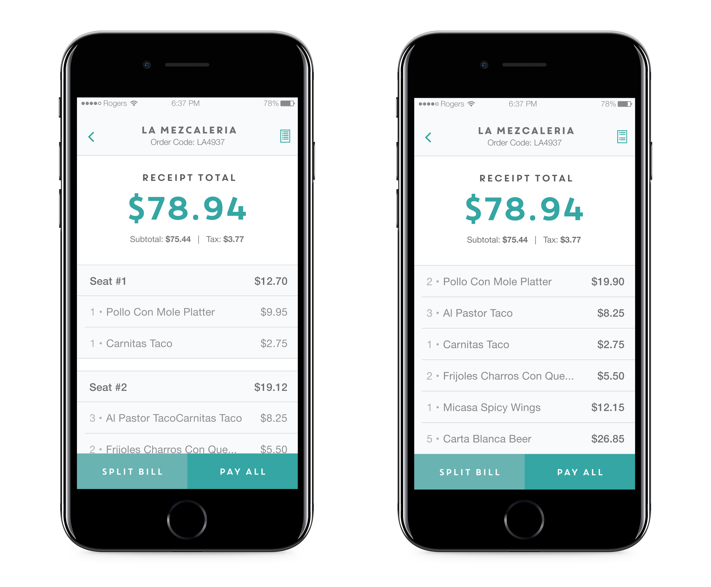
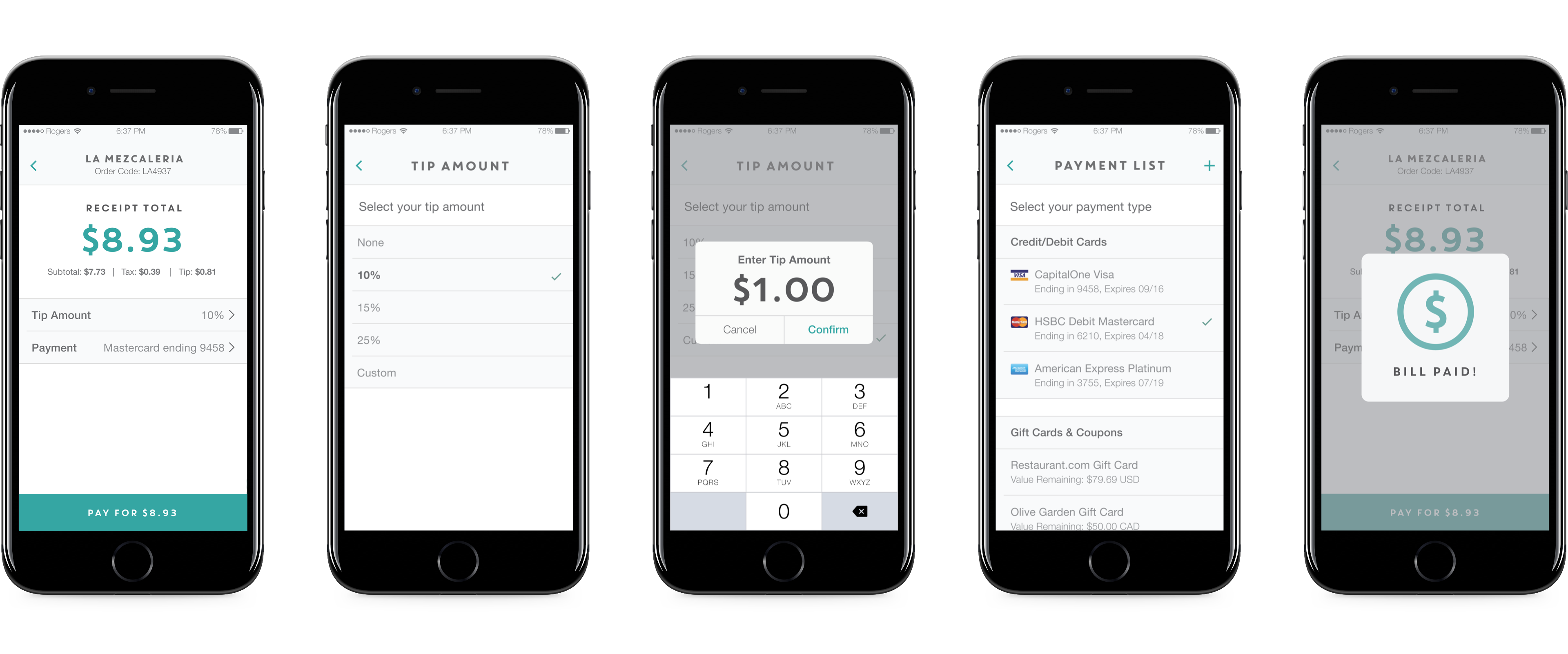
Viewing the Receipt
I saw an opportunity to redesign the typical receipt and rearrange the hierarchy of information. By highlighting the total price at the top, I wanted to make it easy for users to see how much was being spent along with the subtotal and taxes. The user can also toggle between views of their digital receipt. They can view all the ordered items as a list or seperate them by each person's order.
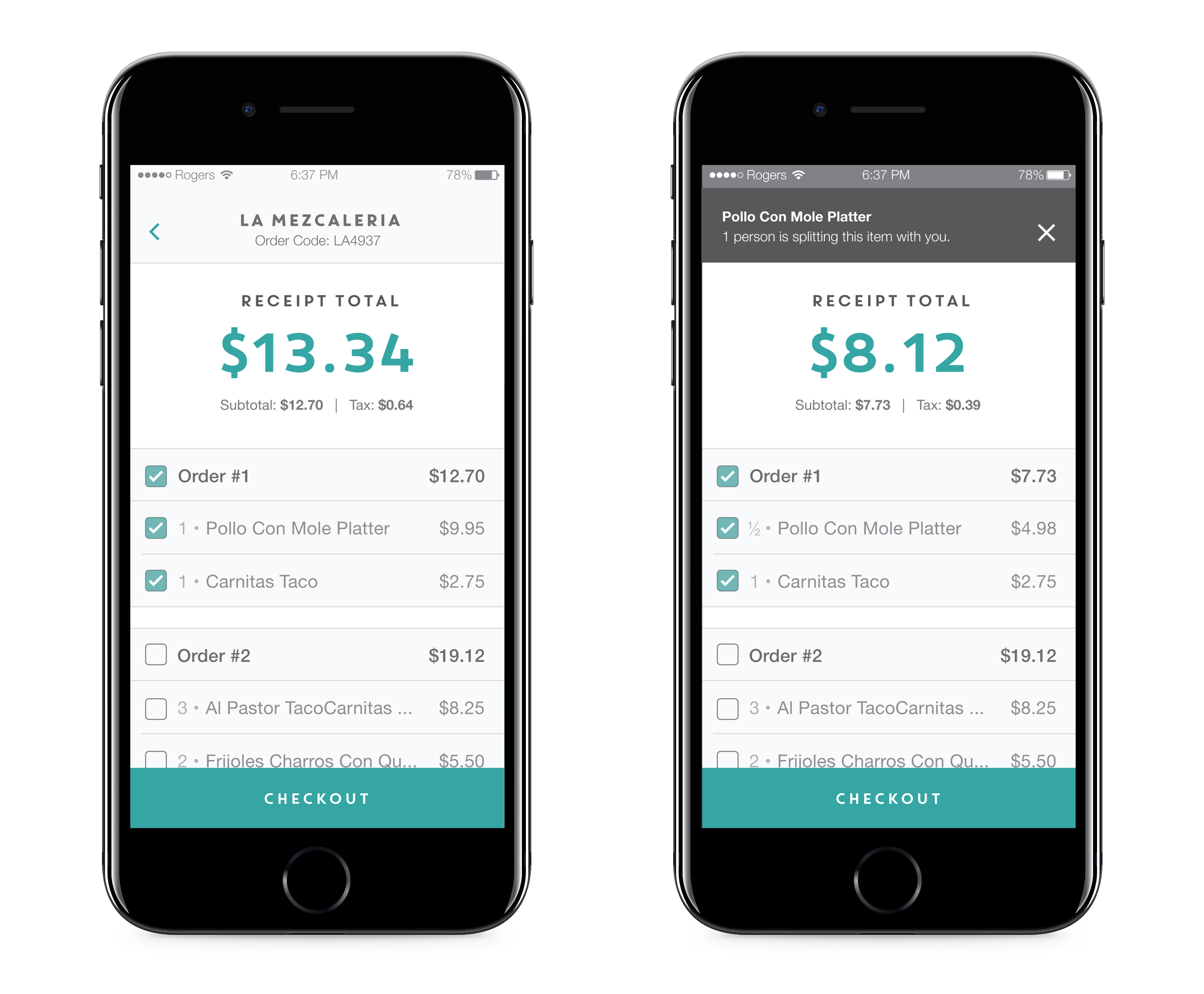
Splitting the Bill
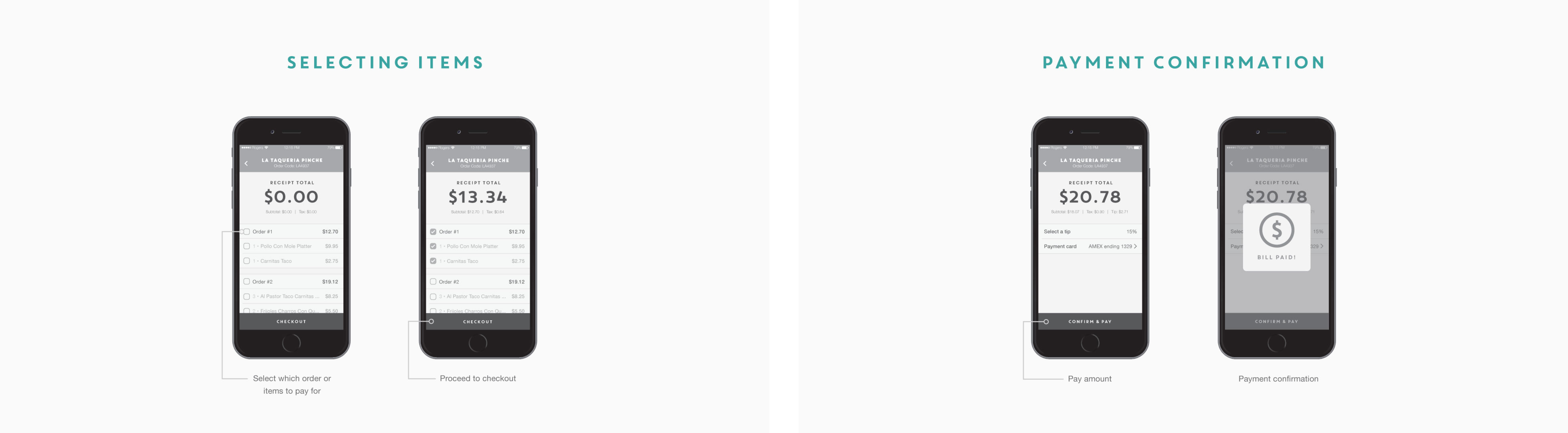
At the end of the meal, most people tend to split the bill and pay for themselves. The user can share the order code with his/her dining companions by: sharing the code physically and allowing them to enter it on their own OR select nearby people who have the Instapay app. Once the bill is split, people can individually select the items they want to pay for.
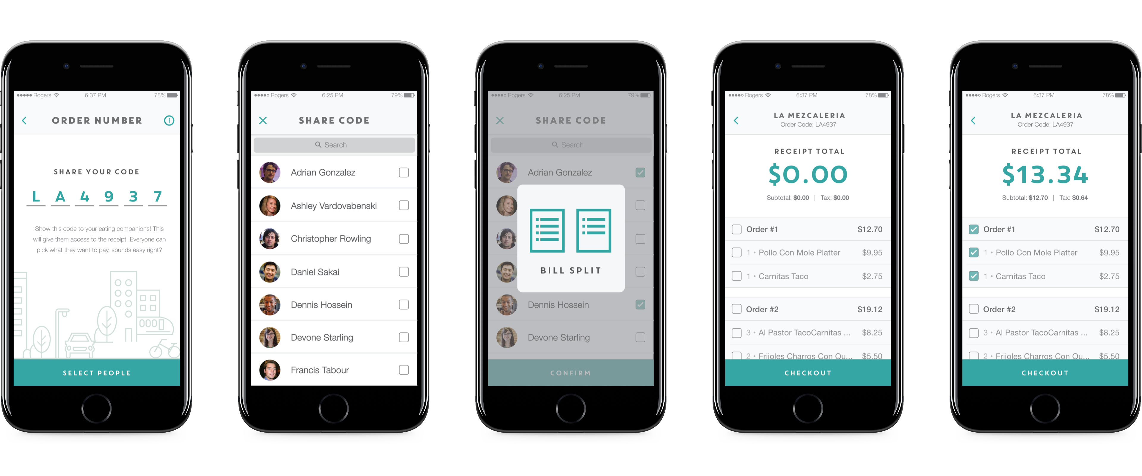
Sharing Items
Sharing items between people is another typical user scenario in dining experiences. To address this, I proposed that multiple people can select the same item. In doing so, the price would be divided by the number of people who have also selected the same item. All users with the selected item will be notified by in-app notifications when someone else has selected the same item.
Paying the Bill
When the user is ready to pay, they can select their tipping amount and payment method. The app will automatically select 10% as the standard tip; users can easily change it to other presets or customize the amount they want to pay. The user can also select from their stored credit cards, gift cards, or add a new payment method.
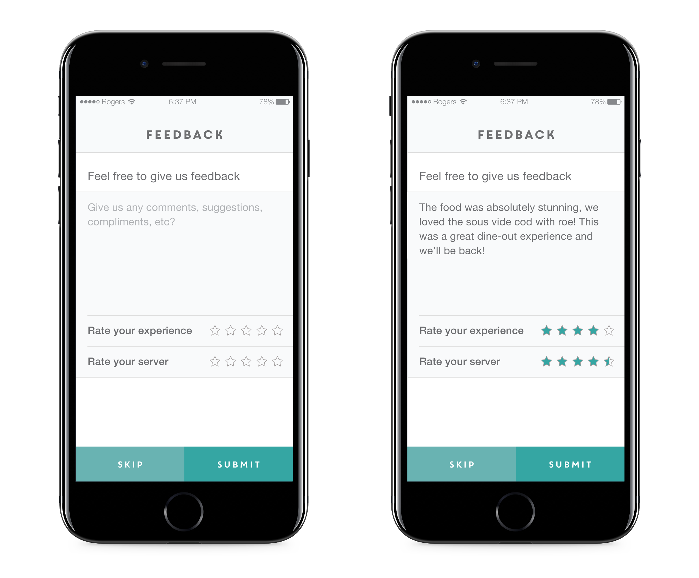
Customer Feedback
After successfully paying for the meal, users can submit a feedback form with their own comments and ratings. This will help restaurants keep track of how well their customer service and waiters are doing. I implemented this feature based on review cards given at the end of a meal at restaurants.
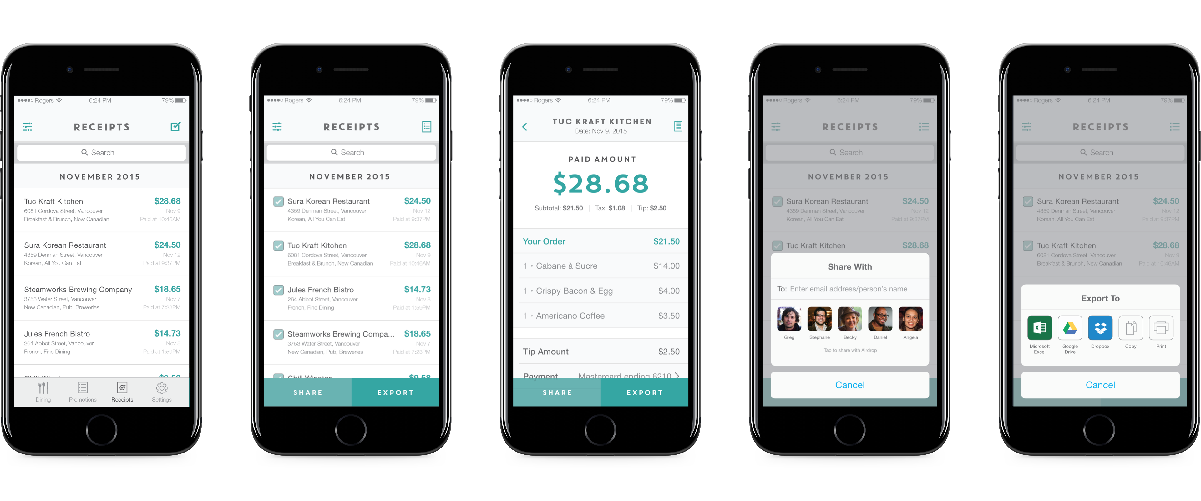
Sharing & Exporting Receipts
Receipt tracking is increasingly important for the money conscious. The app automatically stores all digital receipts, making it easy for users to export them for personal tracking or business expenses. Useres can also share receipts with others if they need to split the bill afterwards.
Ending Thoughts
As technology plays a bigger role in our everyday interactions, mundane tasks can be re-evaluated and improved on through digital experiences. By reimagining the post dining experience (the act of paying), I believe that we're able to bring greater value to customers and restaurants by making payments quick and easy. This is most evident in Square's emergence in the dining scene with their custom POS app which has made managing restuarants and cafes easier. We will begin to see more technology invested in the dining industry as a way to make eating and drinking more immersive, thereby bringing in more revenue and more importantly, user data.
At the end of this project, I noted that there were many different ways we could improve on this experience. Adoption of such a system would be costly (restaurant needs to purchase a new POS system) and hard to gain a following (requires people to download the app). A better solution around this would be to build this concept app into an existing payment company such as Paypal, ApplePay, Venmo or Visa. This would make it easier to market to restaurants and most customers would already use one of the payment apps. I believe the next steps to improve this experience would be to integrate it into a more well known brand.